
This tutorial will provide an overview of how to get started with Angular Material, a UI component library that implements Material Design in Angular. We will cover how to set up an Angular application to use Angular Material and create content to demonstrate the material components, as seen below.
The full code from this tutorial is on my GitHub. Each commit aligns to a step in this post. https://github.com/melissahoughton/angular-material-blog
Set up
Generate the app
Generate a new Angular app and add Angular Material.
-
Use Angular CLI to generate a new Angular App
Run
ng new my-appin the command line, replacingmy-appwith the name of the app.Select
Yfor routing.Select
SCSSfor styles. -
Add Angular Material
Run the following commands
cd my-app
ng add @angular/material
Choose any of the prebuilt themes provided.
Select
Yfor global typography (font styles).Select
Yfor animations.The
addcommand will install@angular/cdkand@angular/materiallibraries and set up the material fonts, icons and base styles.
Remove defaults
The current content is auto-generated by Angular in the first step, but we want to create our own.
Remove everything in app.component.html except for <router-outlet></router-outlet>.
Create the material module
To use the material components in the app, we need to import them. Create a separate material.module.ts to import the individual components, and in the next step, we will import the material module into the app.
While not recommended, the material components can be imported directly into the app.module.ts file.
We will import all the available components for Angular Material to be ready for use in the app. You can simplify this file later to import only the required components.
-
Create a folder called
materialinsrc\app. -
Create a file called
material.module.tsand copy the below contents into that file. Or copy this material module file from my GitHub into the folder.
import { NgModule } from '@angular/core';
import { A11yModule } from '@angular/cdk/a11y';
import { ClipboardModule } from '@angular/cdk/clipboard';
import { DragDropModule } from '@angular/cdk/drag-drop';
import { PortalModule } from '@angular/cdk/portal';
import { ScrollingModule } from '@angular/cdk/scrolling';
import { CdkStepperModule } from '@angular/cdk/stepper';
import { CdkTableModule } from '@angular/cdk/table';
import { CdkTreeModule } from '@angular/cdk/tree';
import { MatAutocompleteModule } from '@angular/material/autocomplete';
import { MatBadgeModule } from '@angular/material/badge';
import { MatBottomSheetModule } from '@angular/material/bottom-sheet';
import { MatButtonModule } from '@angular/material/button';
import { MatButtonToggleModule } from '@angular/material/button-toggle';
import { MatCardModule } from '@angular/material/card';
import { MatCheckboxModule } from '@angular/material/checkbox';
import { MatChipsModule } from '@angular/material/chips';
import { MatStepperModule } from '@angular/material/stepper';
import { MatDatepickerModule } from '@angular/material/datepicker';
import { MatDialogModule } from '@angular/material/dialog';
import { MatDividerModule } from '@angular/material/divider';
import { MatExpansionModule } from '@angular/material/expansion';
import { MatGridListModule } from '@angular/material/grid-list';
import { MatIconModule } from '@angular/material/icon';
import { MatInputModule } from '@angular/material/input';
import { MatListModule } from '@angular/material/list';
import { MatMenuModule } from '@angular/material/menu';
import { MatNativeDateModule, MatRippleModule } from '@angular/material/core';
import { MatPaginatorModule } from '@angular/material/paginator';
import { MatProgressBarModule } from '@angular/material/progress-bar';
import { MatProgressSpinnerModule } from '@angular/material/progress-spinner';
import { MatRadioModule } from '@angular/material/radio';
import { MatSelectModule } from '@angular/material/select';
import { MatSidenavModule } from '@angular/material/sidenav';
import { MatSliderModule } from '@angular/material/slider';
import { MatSlideToggleModule } from '@angular/material/slide-toggle';
import { MatSnackBarModule } from '@angular/material/snack-bar';
import { MatSortModule } from '@angular/material/sort';
import { MatTableModule } from '@angular/material/table';
import { MatTabsModule } from '@angular/material/tabs';
import { MatToolbarModule } from '@angular/material/toolbar';
import { MatTooltipModule } from '@angular/material/tooltip';
import { MatTreeModule } from '@angular/material/tree';

@NgModule({
  exports: [
    A11yModule,
    ClipboardModule,
    CdkStepperModule,
    CdkTableModule,
    CdkTreeModule,
    DragDropModule,
    MatAutocompleteModule,
    MatBadgeModule,
    MatBottomSheetModule,
    MatButtonModule,
    MatButtonToggleModule,
    MatCardModule,
    MatCheckboxModule,
    MatChipsModule,
    MatStepperModule,
    MatDatepickerModule,
    MatDialogModule,
    MatDividerModule,
    MatExpansionModule,
    MatGridListModule,
    MatIconModule,
    MatInputModule,
    MatListModule,
    MatMenuModule,
    MatNativeDateModule,
    MatPaginatorModule,
    MatProgressBarModule,
    MatProgressSpinnerModule,
    MatRadioModule,
    MatRippleModule,
    MatSelectModule,
    MatSidenavModule,
    MatSliderModule,
    MatSlideToggleModule,
    MatSnackBarModule,
    MatSortModule,
    MatTableModule,
    MatTabsModule,
    MatToolbarModule,
    MatTooltipModule,
    MatTreeModule,
    PortalModule,
    ScrollingModule,
  ]
})
export class MaterialModule {}
This file imports all the available material components and adds them as exports in a MaterialModule which will expose them to the app.
Import the material module
In app.module.ts, an import statement to the material module created in the last step.
Add MaterialModule to the imports array of the AppModule to import it into the app.
import { BrowserModule } from '@angular/platform-browser';
import { NgModule } from '@angular/core';

import { AppRoutingModule } from './app-routing.module';
import { AppComponent } from './app.component';
import { BrowserAnimationsModule } from '@angular/platform-browser/animations';
import { MaterialModule } from './material/material.module';

@NgModule({
  declarations: [AppComponent],
  imports: [
    BrowserModule,
    AppRoutingModule,
    BrowserAnimationsModule,
    MaterialModule,
  ],
  providers: [],
  bootstrap: [AppComponent],
})
export class AppModule {}
The app is now ready to use angular material. Continue on the next step to add content into the app, which demonstrates material components.
Add content
Create a component
-
Generate a component using Angular CLI
Run
ng generate component home -
Set up the routes
Replace the empty routes in
app.routing.module.tswithconst routes: Routes = [ { path: '', component: HomeComponent }, { path: '**', redirectTo: '/', pathMatch: 'full' } ];
These steps have created a component called Home and set this as the base page.
Run ng serve to compile the app and see the text home works!
Add basic styles
Add basic styles to create spacing on the page. We will use CSS FlexBox. Angular also provides a robust Flex-Layout API @angular/flex-layout which combines CSS FlexBox and mediaQuery.
-
Add the material background style. In
index.htmladd classmat-app-backgroundto the body tag. -
Wrap the
<router-outlet></router-outlet>tag in adivwith a classcontainer -
Add the following styles into
app.component.scss.container { max-width: 800px; margin: 4em auto; padding: 0 20px; } .container > * { display: flex; flex-direction: column; justify-content: center; } -
Add the following styles into
home.component.scss.flex-container { display: flex; justify-content: space-around; flex-wrap: wrap; padding: 16px; } button { margin: 8px; } .mat-radio-button ~ .mat-radio-button { margin-left: 16px; }
Create a header toolbar bar
In app.component.html add a toolbar above the container div to be our app header
<mat-toolbar class="mat-elevation-z6" color="primary"></mat-toolbar>
Run ng-serve and open your browser to see the header at the top of the app.
We have now added our first Angular Material component. The components are styled based on the theme.
We have set the bar to the theme’s primary colour using the color attribute.
The material elevation classes add shadows to create a textured material look.
Add Angular Material Components
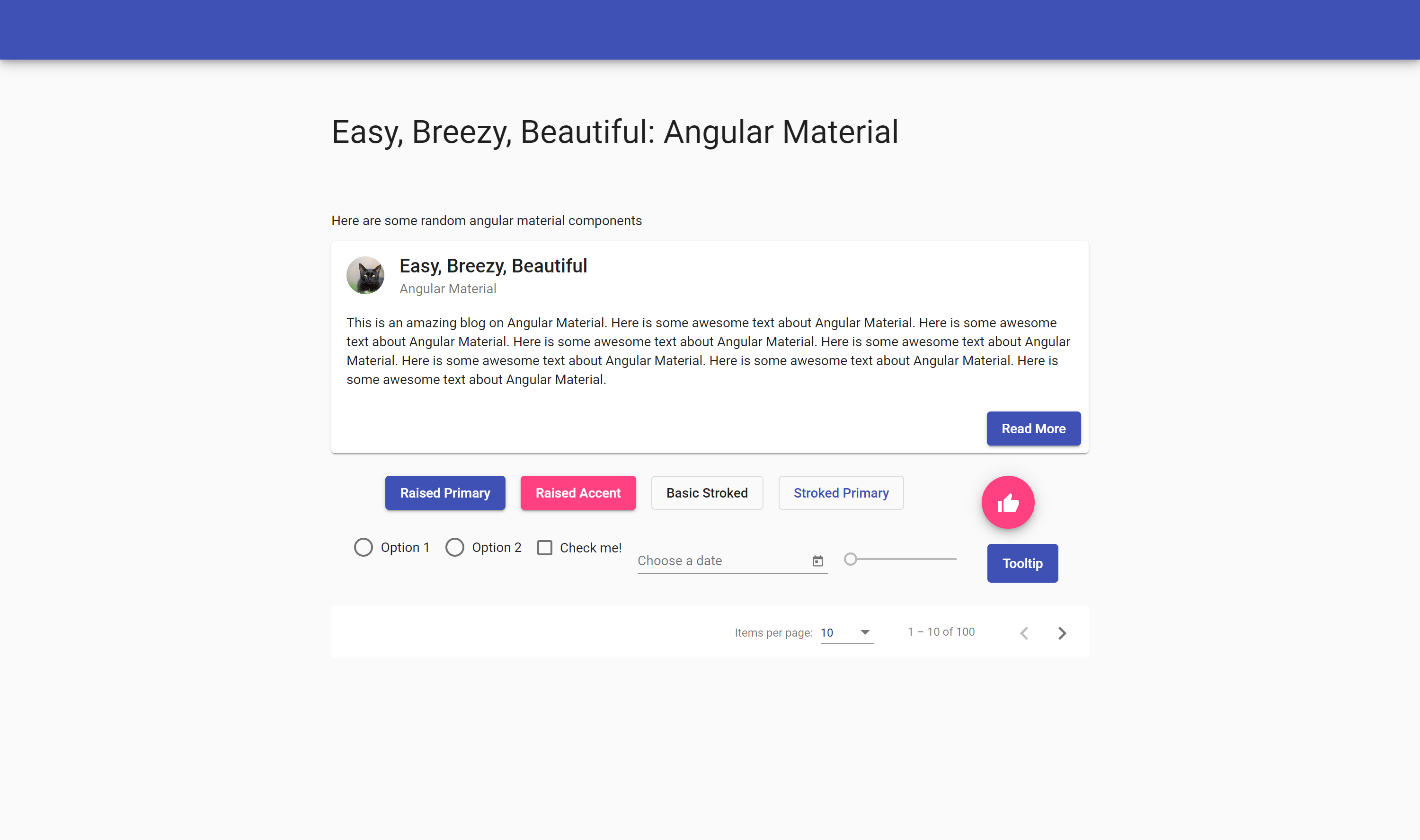
Replace the contents of home.component.html with the below code, which contains a sample of material components. Refresh your browser to see the Angular Material components in action.
<h1 class="mat-display-1">Easy, Breezy, Beautiful: Angular Material</h1>

<p>Here are some random angular material components</p>

<mat-card>
  <mat-card-header>
    <img
      mat-card-avatar
      src="https://cdn.pixabay.com/photo/2018/10/11/12/31/black-cat-3739702_1280.jpg"
      alt="My Photos"
    />
    <mat-card-title>Easy, Breezy, Beautiful</mat-card-title>
    <mat-card-subtitle>Angular Material</mat-card-subtitle>
  </mat-card-header>
  <mat-card-content>
    <p>
      This is an amazing blog on Angular Material. Here is some awesome text
      about Angular Material. Here is some awesome text about Angular Material.
      Here is some awesome text about Angular Material. Here is some awesome
      text about Angular Material. Here is some awesome text about Angular
      Material. Here is some awesome text about Angular Material. Here is some
      awesome text about Angular Material.
    </p>
  </mat-card-content>
  <mat-card-actions align="end">
    <button mat-raised-button color="primary">Read More</button>
  </mat-card-actions>
</mat-card>

<div class="flex-container">
  <div>
    <button mat-raised-button color="primary">Raised Primary</button>
    <button mat-raised-button color="accent">Raised Accent</button>
    <button mat-stroked-button>Basic Stroked</button>
    <button mat-stroked-button color="primary">Stroked Primary</button>
  </div>

  <button mat-fab>
    <mat-icon>thumb_up</mat-icon>
  </button>

  <mat-radio-group aria-label="Select an option">
    <mat-radio-button value="1">Option 1</mat-radio-button>
    <mat-radio-button value="2">Option 2</mat-radio-button>
  </mat-radio-group>

  <mat-checkbox>Check me!</mat-checkbox>

  <mat-form-field>
    <mat-label>Choose a date</mat-label>
    <input matInput [matDatepicker]="picker" />
    <mat-datepicker-toggle matSuffix [for]="picker"></mat-datepicker-toggle>
    <mat-datepicker #picker></mat-datepicker>
  </mat-form-field>

  <mat-slider></mat-slider>

  <button
    mat-flat-button
    color="primary"
    matTooltip="Info about the action"
    matTooltipPosition="after"
    aria-label="Button that displays a tooltip when focused or hovered over"
  >
    Tooltip
  </button>
</div>

<mat-paginator
  [length]="100"
  [pageSize]="10"
  [pageSizeOptions]="[5, 10, 25, 100]"
></mat-paginator>
Congratulations! You now have an Angular app using Angular Material.
Check out the Angular Material documentation for the full set of components and how to use them.